Theme Settings
Overview
Theme Settings are where you customize the look of your website. This is where you manage global styles, such as colors, typography, and spacing, and select your header and footer, ensuring a consistent feel across every page and component of your Act3 project.
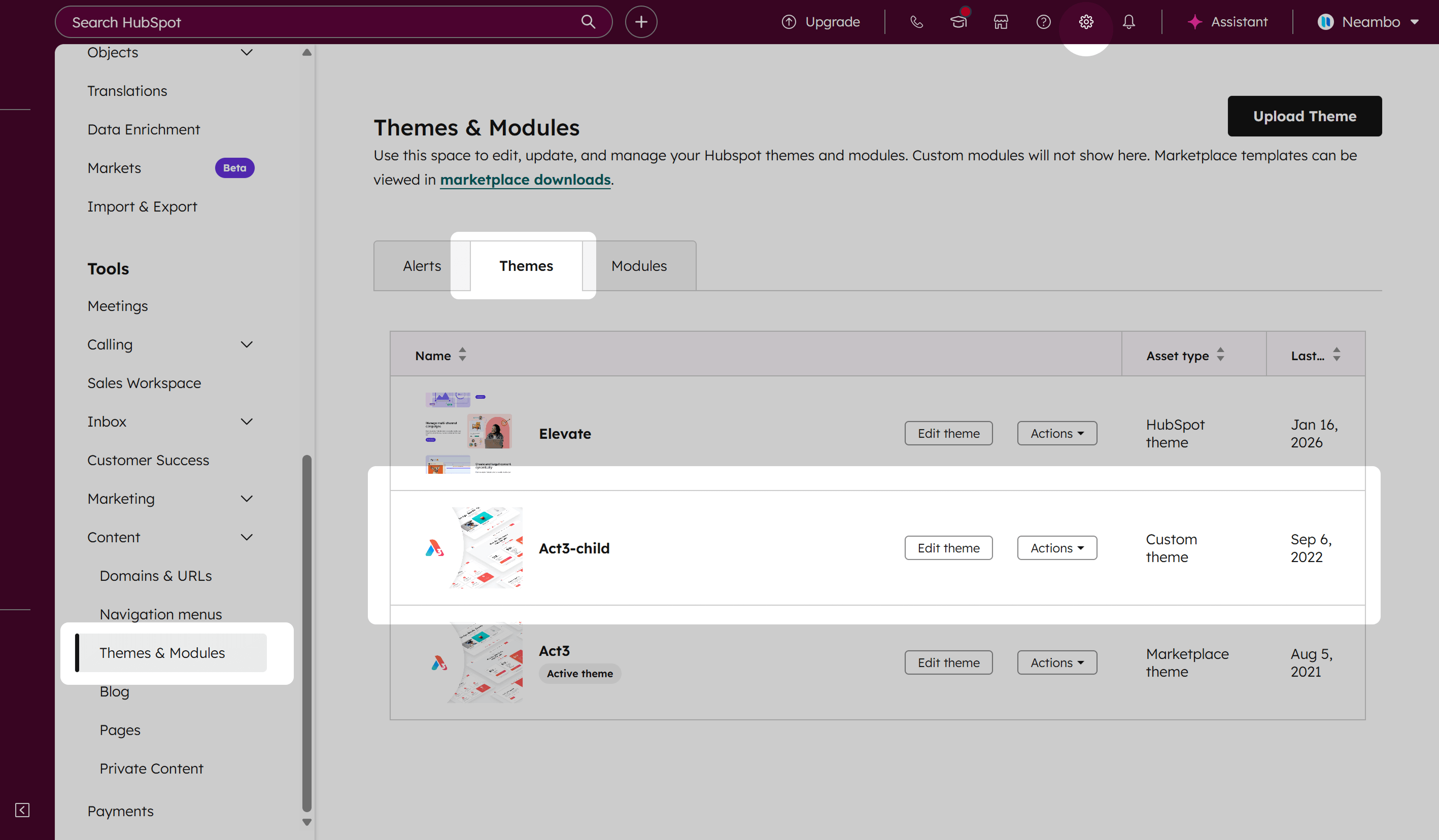
To customize your theme, go to Settings › Content › Themes, look for your child theme, and click Edit theme:
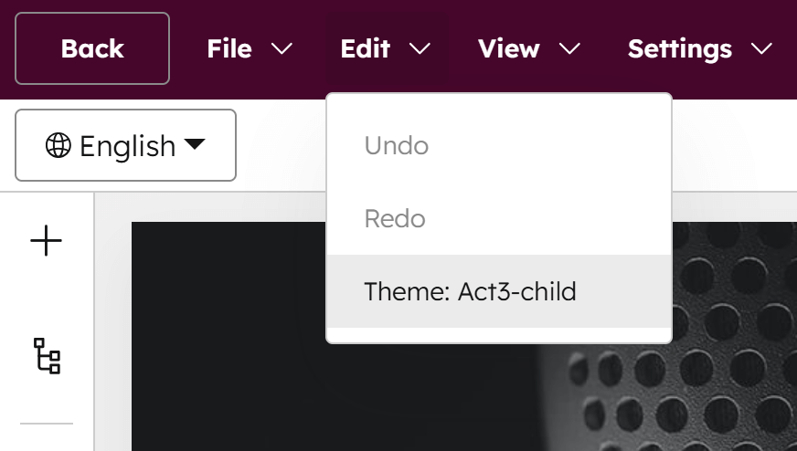
Alternatively, you can open the theme settings from any page using the theme via the top menu: Edit › Theme: Your theme
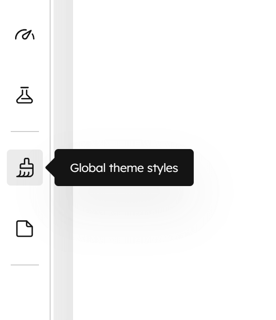
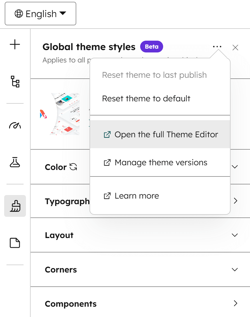
Another option is to edit your theme settings directly from the current page using the Global theme styles option in the sidebar:
Please note:
Any changes you make here will affect all pages using the theme once you publish the current page, not just the page you're editing.
There's also an option to open the theme settings page from here:
Color
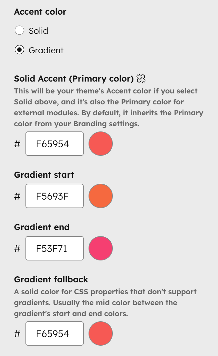
Accent color
This sets the tone for your theme. You can choose either a Solid accent color or a Gradient. The gradient consists of two colors—a Gradient start and a Gradient end—plus a Gradient fallback solid color for elements that don’t support CSS gradients. Whether solid or gradient, the accent color is your primary brand color and appears throughout your website—on buttons, icons, some cards, and even glow shadows. For best results, pick an accent color that looks good and remains visible on both light and dark backgrounds.
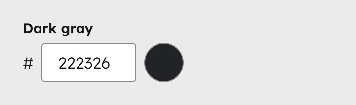
Dark gray
This color is part of your theme's grayscale or neutral palette. Choose only a very dark gray or black. Do not use vivid colors. It is applied to the header navigation, UI icons, dark transparent overlays on background images, headings (unless overridden), and other dark UI elements. This should be the darkest value in your theme's grayscale.
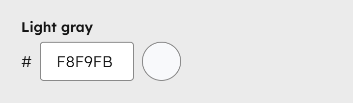
Light gray
This is part of your theme's grayscale or neutral palette. Choose only a very light gray. Do not use vivid colors. It is mainly used for very light, almost white backgrounds, especially to differentiate alternating sections. Light gray should be the lightest value in your theme's grayscale.
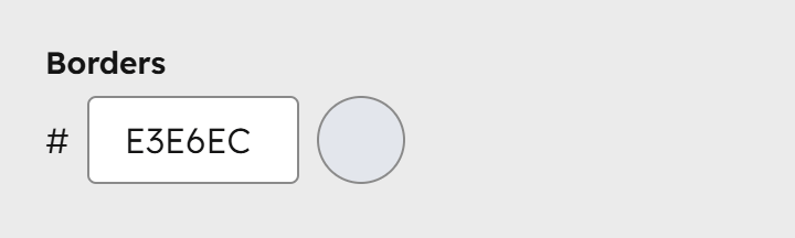
Borders
This color is part of your theme's grayscale or neutral palette. Choose a gray slightly darker than your Light gray. Do not use vivid colors. It is mainly used for borders on sections, headers, menus, inputs, and similar elements. In components with dark schemes, some borders will appear white and transparent.
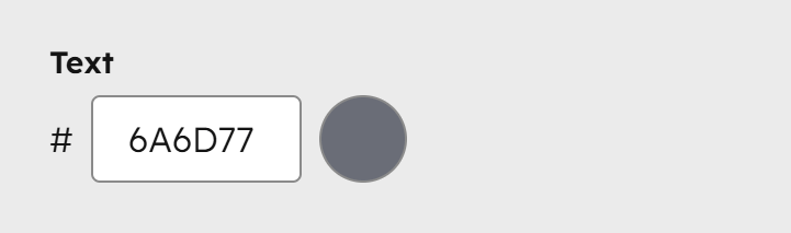
Text
This color is the default for your website's body text. Choose a neutral color—either the same as Dark gray or slightly lighter. Since text is essential, use a contrast checker like webaim.org to ensure it is clearly visible, including for users with visual impairments. In components with dark schemes, text will appear white.
Headings
This color is the default for your website's headings and titles. It inherits the Dark gray value unless you choose another color. We recommend a neutral dark gray—slightly darker than body text—to provide more contrast and make headings stand out. In components with dark schemes, headings will appear white and fully opaque.

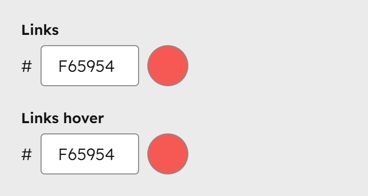
Links
These are the default colors used for links in their normal and hover states. By default, links inherit the Accent color, unless you choose other colors. Some links in specific components (menus, cards, etc.) may use different colors, like Dark gray, Text, or Headings, depending on the component design. These colors apply to all other standard links in your text blocks. In components with dark schemes, links will appear white and fully opaque.
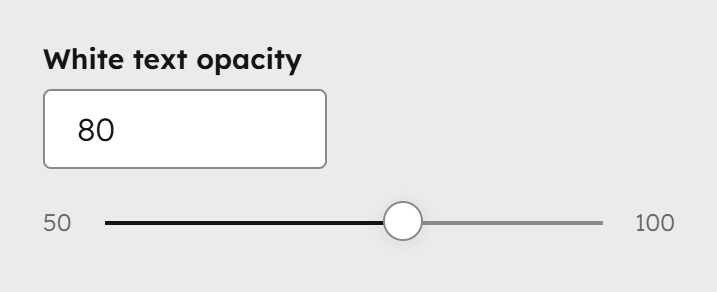
White text opacity
This controls the opacity of the base white text in components with dark or accent backgrounds. Headings, links, and other key elements remain fully opaque (100%). Opacities for borders, backgrounds, and other elements in the dark theme are pre-set in Act3, but you can adjust the base text here from semi-transparent (50) to fully opaque (100) if needed. Most of the time, you won’t need to change it.
Please note:
We skiped the Secondary and Tertiary colors because are not used in the theme by default. They are intended for external modules and are required by the Marketplace.
Typography
Fonts
This is where you'll define your theme fonts. For consistency, use the same font across all fields and vary only the weight for normal and bold text. Prefer web-safe fonts (e.g., Arial, Georgia, Times New Roman, Tahoma, Verdana, Helvetica) for better page speed. External fonts, like Google Fonts, may affect load times.
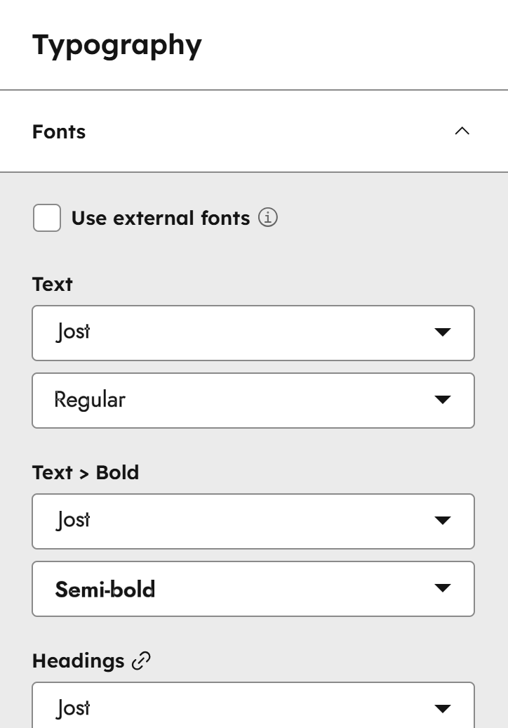
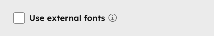
Use external fonts
Check this box if you want to serve your own font files or have a script or stylesheet from your font vendor. This will remove all font fields from the theme settings, and you will have to follow our guide on how to include external fonts.
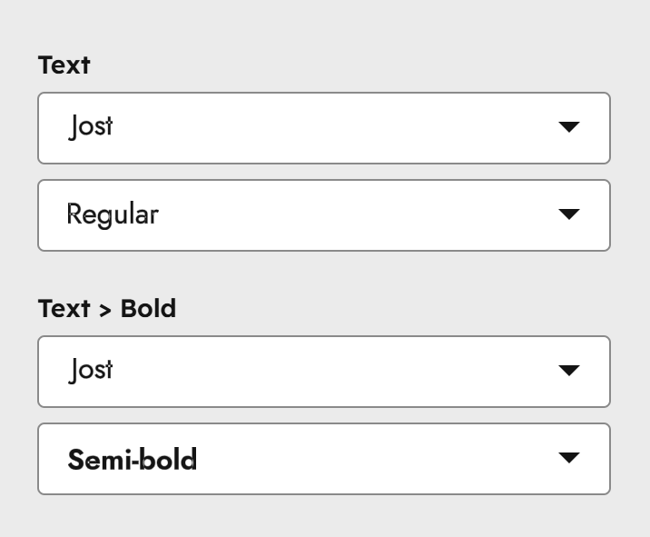
Text
This is the font used for your body text. Choose the same font name for both the Text and Text > Bold fields. Only the font variation (the second drop-down) can differ.
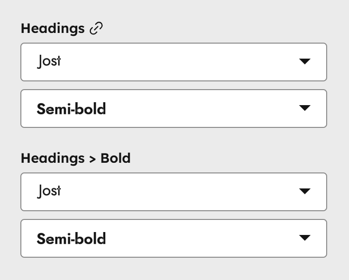
Headings
This is the font used for your headings. Select the same font name for both the Headings and Headings > Bold fields. Only the font variation (second drop-down) can differ. You should only choose a different variation for the Headings > Bold field if your headings aren’t bold by default and you want to manually bold certain words using the rich text editor.
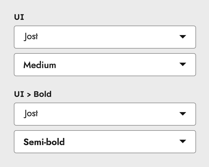
UI
This font is used for various UI elements, such as buttons, tooltips, some card labels, blog tags, pagination, numbers, and more. In most cases, it can be the same font used for your Headings. Select the same font name for both the UI and UI > Bold fields. Only the font variation (second drop-down) can differ.
Text
Fonts are defined separately above. This section controls the default text properties used across your website.
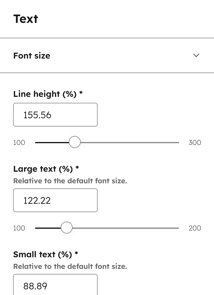
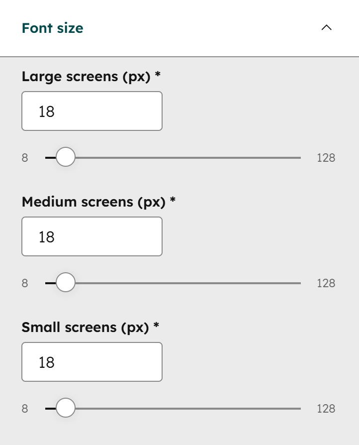
Font size
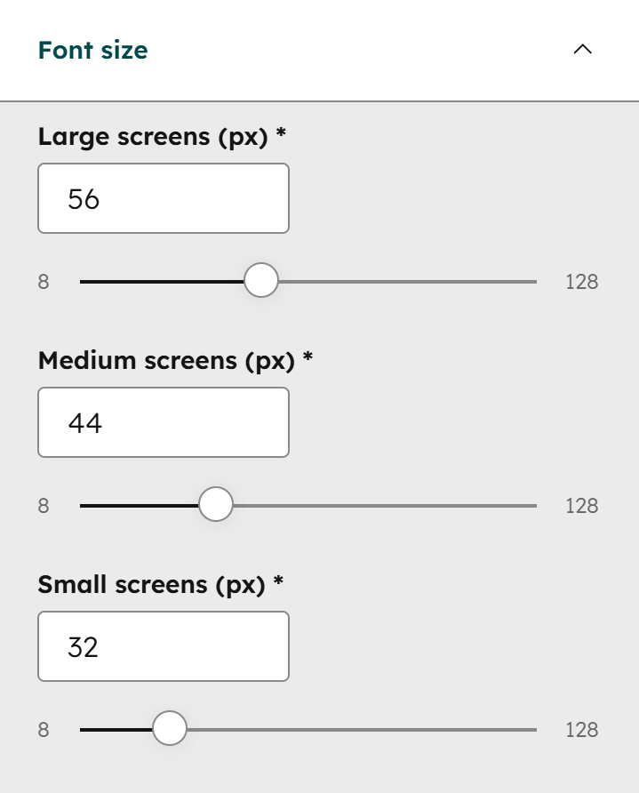
This is where you can adjust your website's body text size for all three screen sizes (breakpoints). The font sizes are entered in pixels for easier customization, but they are converted to rem units behind the scenes as a best practice. In most cases, all three values can be the same, but depending on your font, you may want to adjust the size for smaller screens.
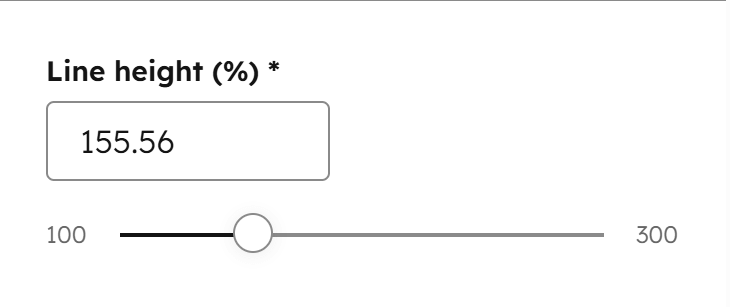
Line height
Use this to adjust the spacing between lines of text.
Large text
Certain elements in Act3 use a larger font size by design (e.g., section intro overlines, blog next/previous post links, column navigation titles, some footer titles, etc.). Here, you can adjust the large text size, which is relative to the body text size and will automatically scale across all three screen sizes if the body text size changes.
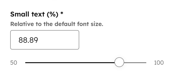
Small text
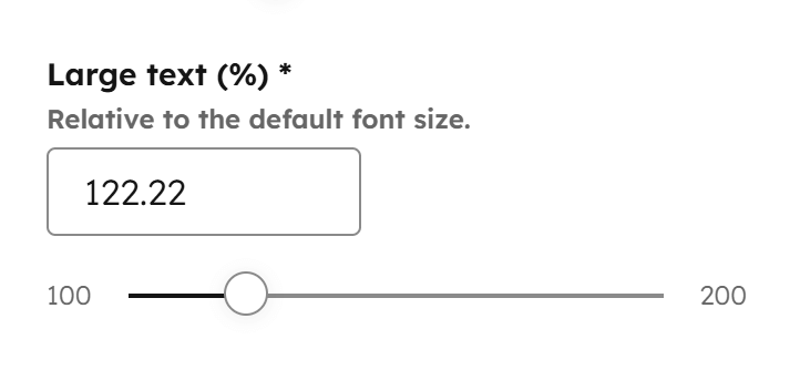
Certain elements in Act3 use a smaller font size by design (e.g., accordion back-to-top links, some card text, info text, etc.). Here, you can adjust the small text size, which is relative to the body text size and will automatically scale across all three screen sizes if the body text size changes.
Headings
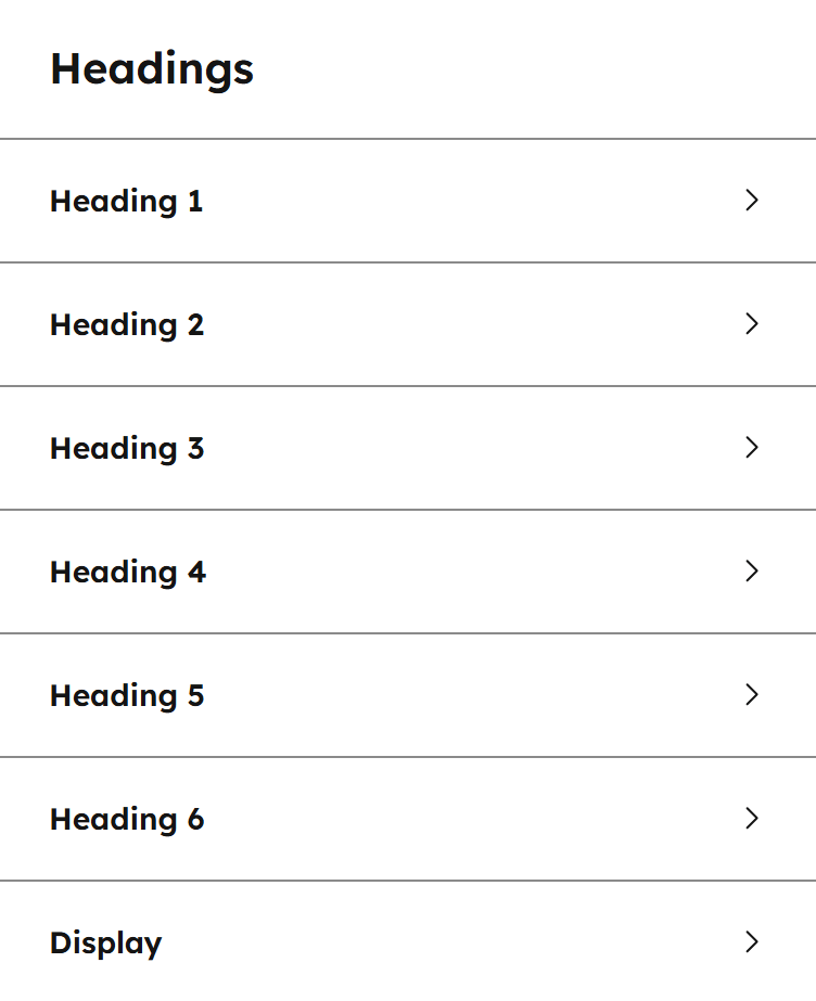
Here you can adjust your heading properties. For best results, set the heading styles according to a proper hierarchy: Display as the largest, followed by Heading 1 > Heading 2 > Heading 3 > Heading 4 > Heading 5 > Heading 6.
Font size
Set the font size for each heading type for all three screen sizes (breakpoints).
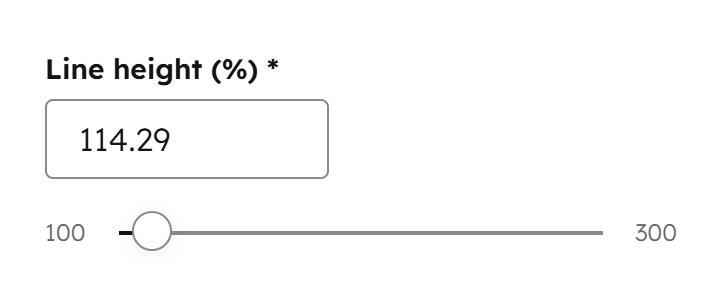
Line height
Use this to increase or decrease the distance between lines of text for each heading type.
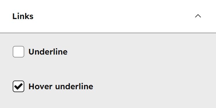
Links
Here you can adjust the properties of your links. By design, some links from specific components are not affected by these settings. For best usability, keep only Underline or Hover underline checked, not both, so users get a clear visual cue when hovering over links.
Word breaking
These settings controls how long words break across multiple lines.
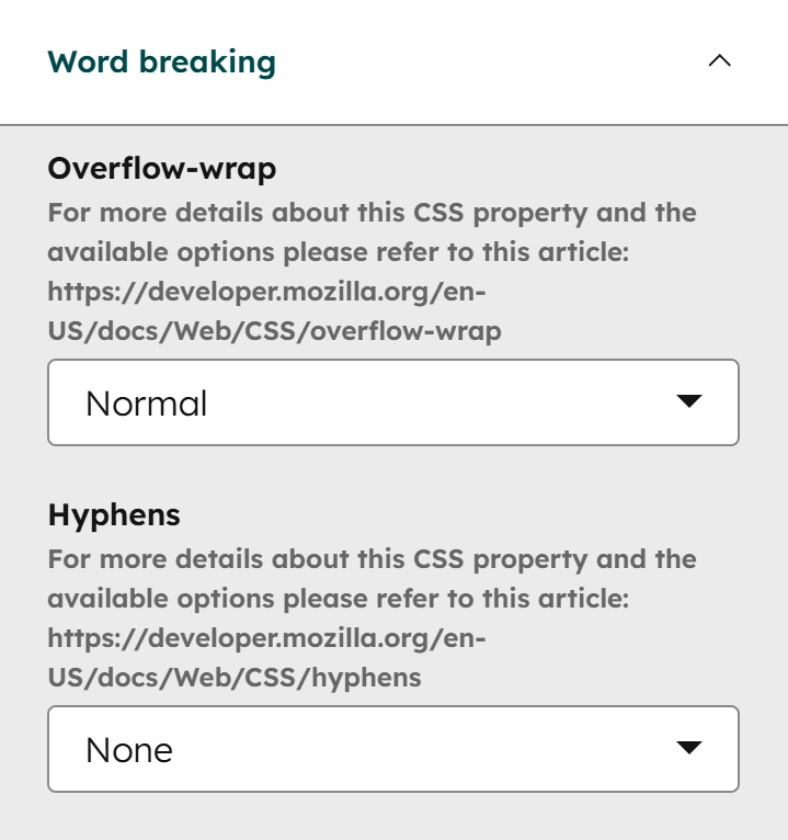
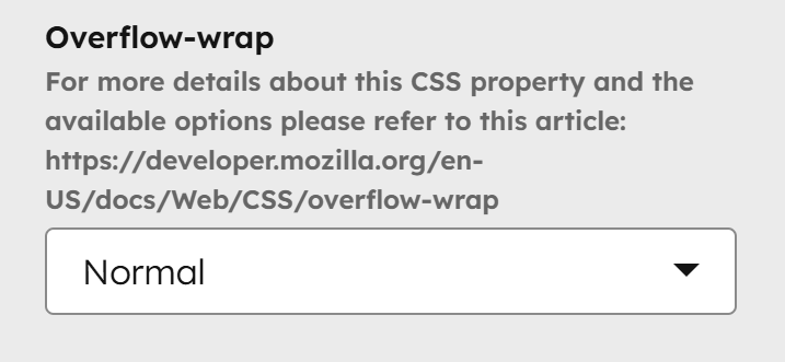
Overflow-wrap
Controls whether long words or URLs will automatically break to the next line instead of overflowing their container. Normal is the default and only breaks lines at normal word break points (like spaces). Anywhere allows breaking at any character in a word, even if it’s not strictly needed, to prevent overflow. Break-word breaks words only when necessary to avoid overflow, including long URLs, but doesn’t break arbitrarily like Anywhere. For more details about this CSS property, read more here on MDN.
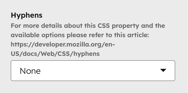
Hyphens
Controls how words are split with hyphens at the end of a line. None never adds hyphens. Manual only adds hyphens where you insert them in your text. Auto allows the browser to automatically insert hyphens where appropriate to improve line breaks. For more details about this CSS property, read more here on MDN.
Layout
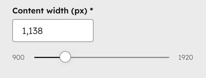
Content width
This setting controls the default content width of your website. It is used for the header, footer, and content sections unless adjusted manually.
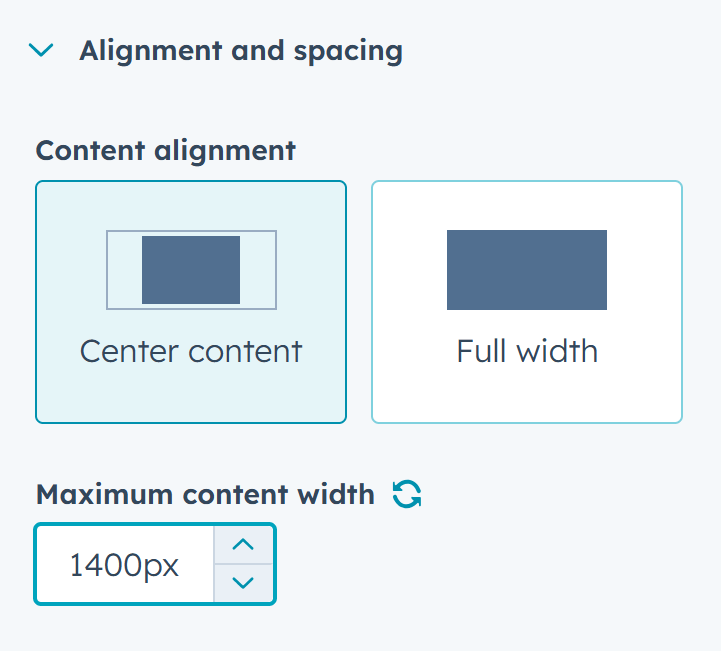
Please note:
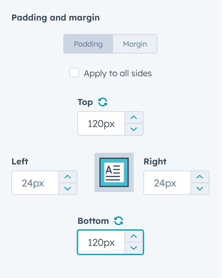
You can change or remove this on a particular section by clicking the section, then Alignment and spacing and Center content to specify a Maximum content width, or Full width to remove this maximum width altogether:
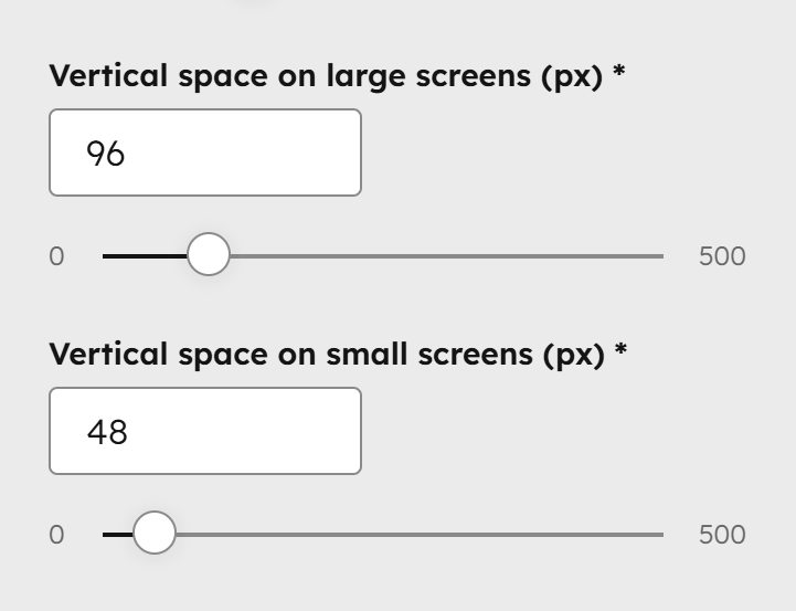
Vertical space
This sets the default padding at the top and bottom of your sections, which can vary between large and small screens. Some templates may override this value for specific section designs.
Please note:
You can change or remove this padding for a specific section by selecting the section, then going to Alignment and spacing and clicking Padding and margin. You can also set different padding for mobile by switching the editor to mobile view.
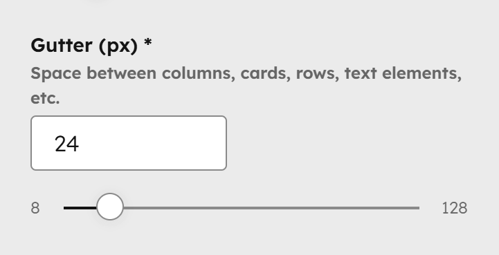
Gutter
The regular spacing between columns, cards, headings, text elements, and other content. You usually don’t need to change this, but if you do, keep it relatively small—values like 15px, 20px, or 30px work well.
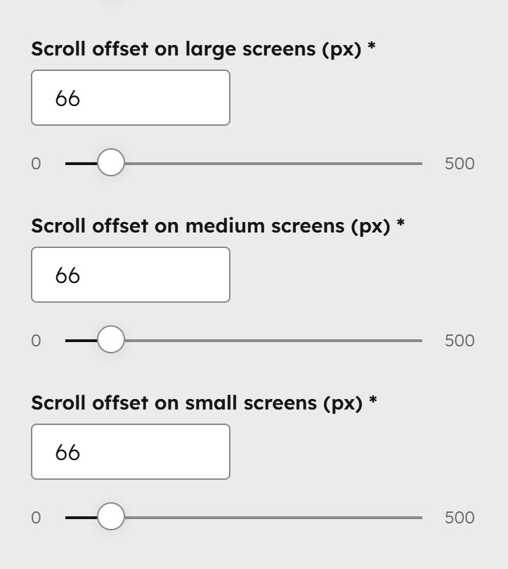
Scroll offset
The number of pixels added at the top of a programmatically scrolled page (for example, when a user changes a listing page or clicks an anchor link). This offsets the height of the sticky header so the top of the target content isn’t hidden behind it. Set this value based on your sticky header’s height and adjust until it fits correctly. You can specify values for all three screen sizes (breakpoints) since the sticky header may have different heights on different screens. These fields will disappear if the sticky header is disabled in your theme settings.
Corners
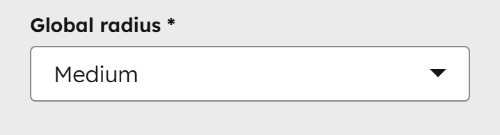
Global radius
This controls the corner rounding of elements and components in the theme. Choose Square for a classic, straightforward look, or Small, Medium, or Large for a more modern, friendly appearance. With Large selected, all buttons and form inputs will appear pill-shaped unless overridden by the settings below.
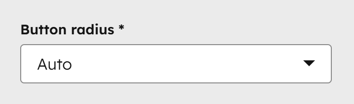
Button radius
Applies to buttons. Choose Auto to use the Global radius, or select a custom value for the button corners.
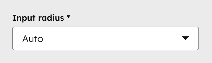
Input radius
Applies to form inputs. Choose Auto to use the Global radius, or select a custom value for the input corners.
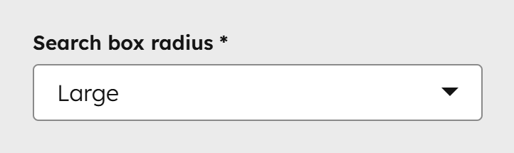
Search box radius
Applies to search boxes. Choose Auto to use the Global radius, or select a custom value for the corners.
Components
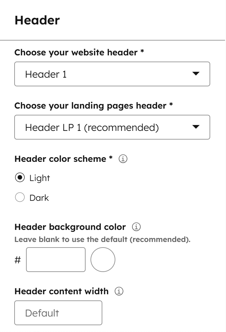
Header
Learn more about the headers and these options from our Header documentation.
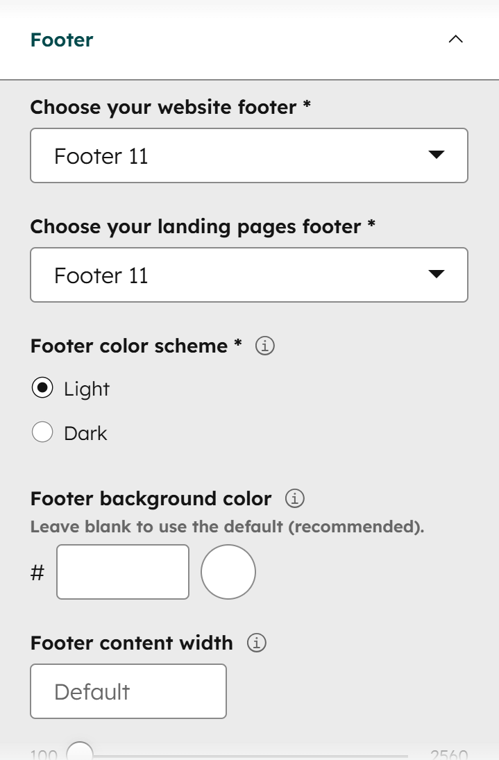
Footer
Learn more about the footers and these options from our Footer documentation.
UI icon size
Resize various UI icons, such as the search icon, hamburger menu, and arrows, as needed. This is especially useful when adjusting the default font size, since icons may look disproportionate with very small or very large text.
Miscellaneous
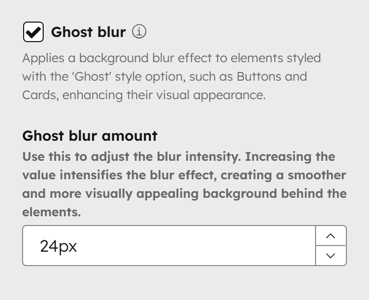
Ghost blur
Starting with Version 28, a background blur effect is applied to elements using the 'Ghost' style, such as Buttons and Cards, enhancing their appearance. Use the Ghost blur amount to adjust the intensity—higher values create a stronger blur, producing a smoother, more visually appealing background behind the elements.
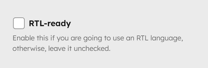
RTL-ready
Enable this if your website will use a right-to-left (RTL) language. Otherwise, leave it unchecked.